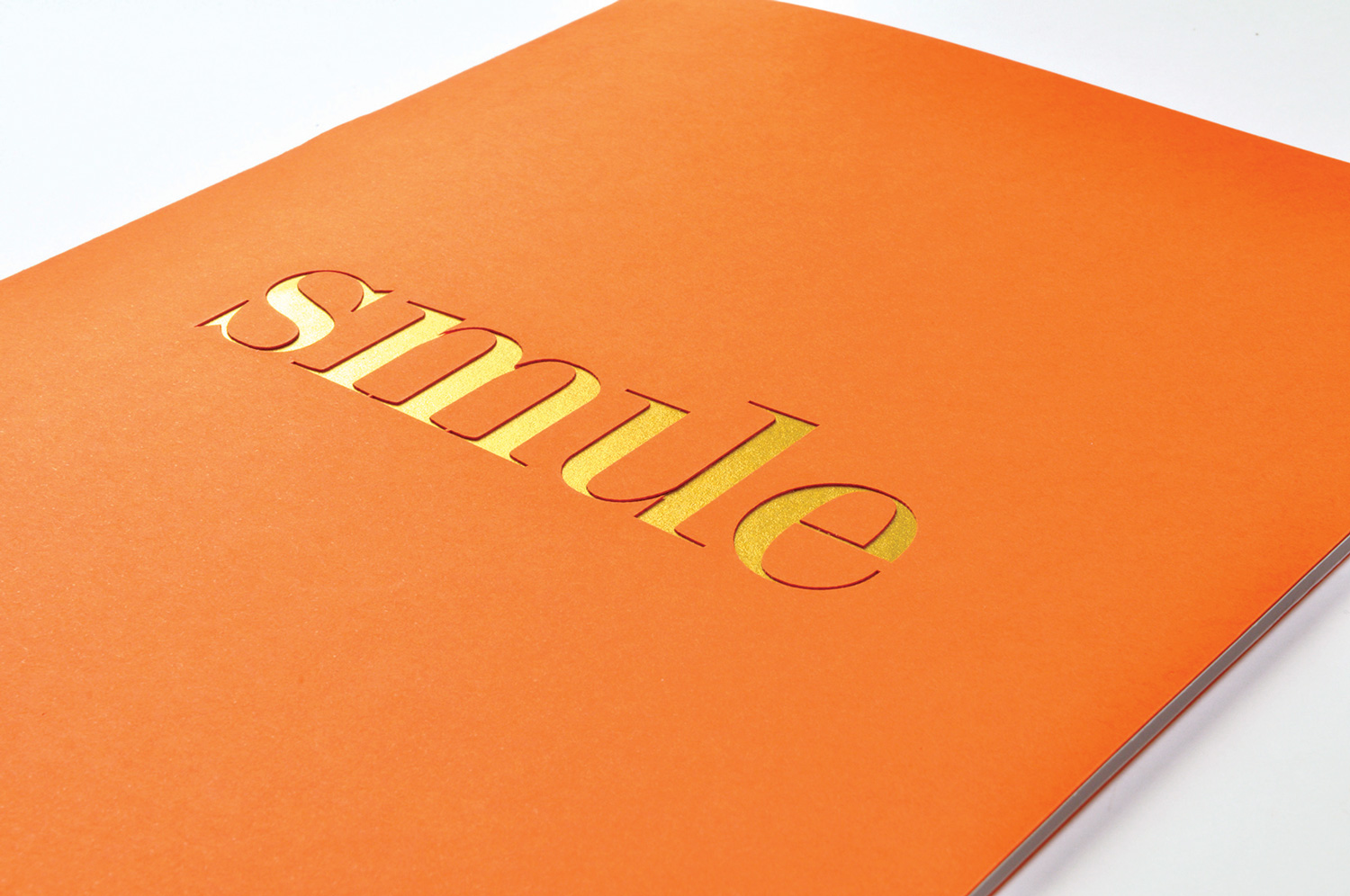
Brief: Create packaging for a 21st Century Scotch whisky brand that challenges category convention and rituals and appeals to an international female consumer.
Role: Concept, Art Direction, Brand Identity Creation, Copywriting, Print Design.
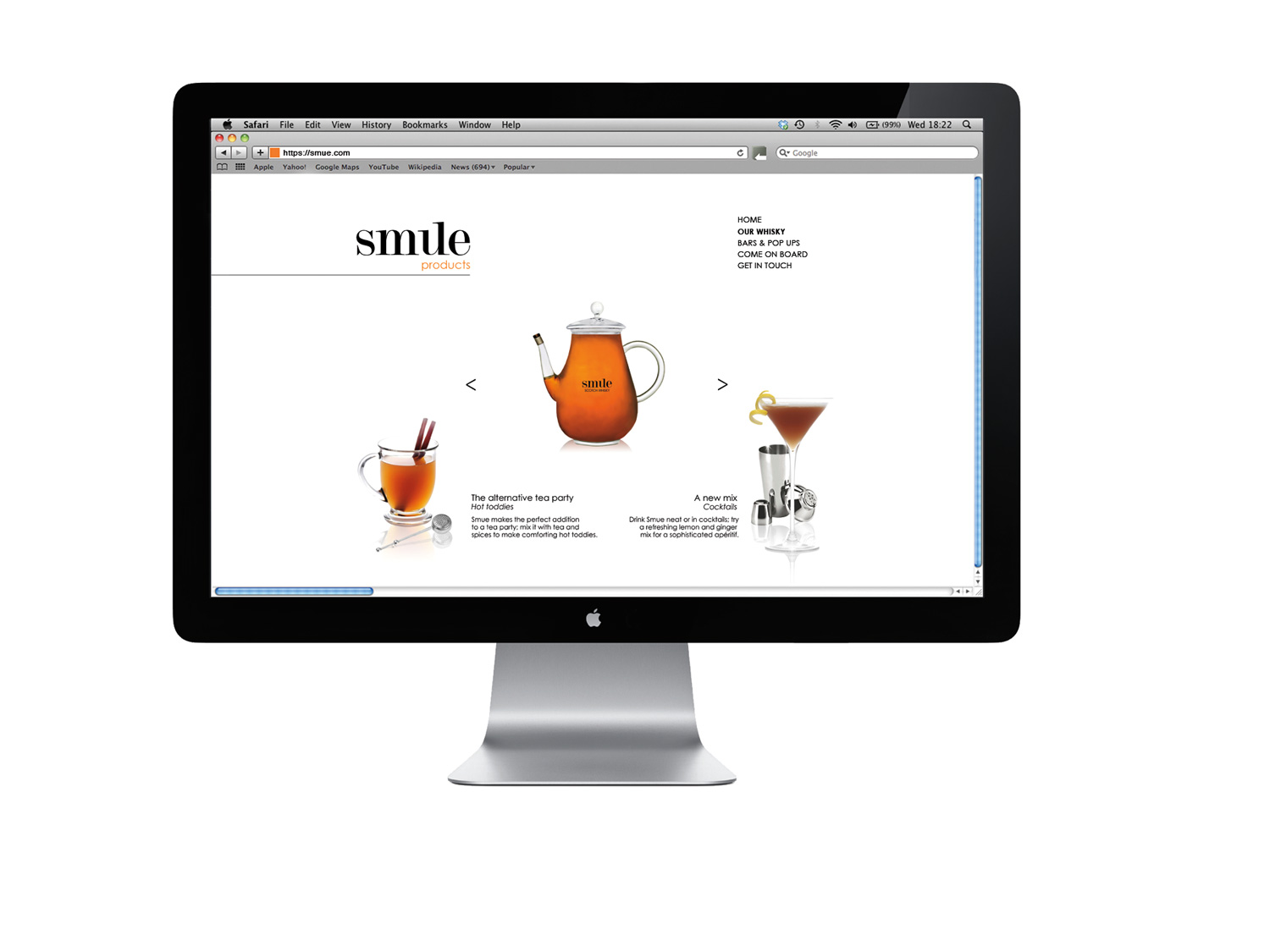
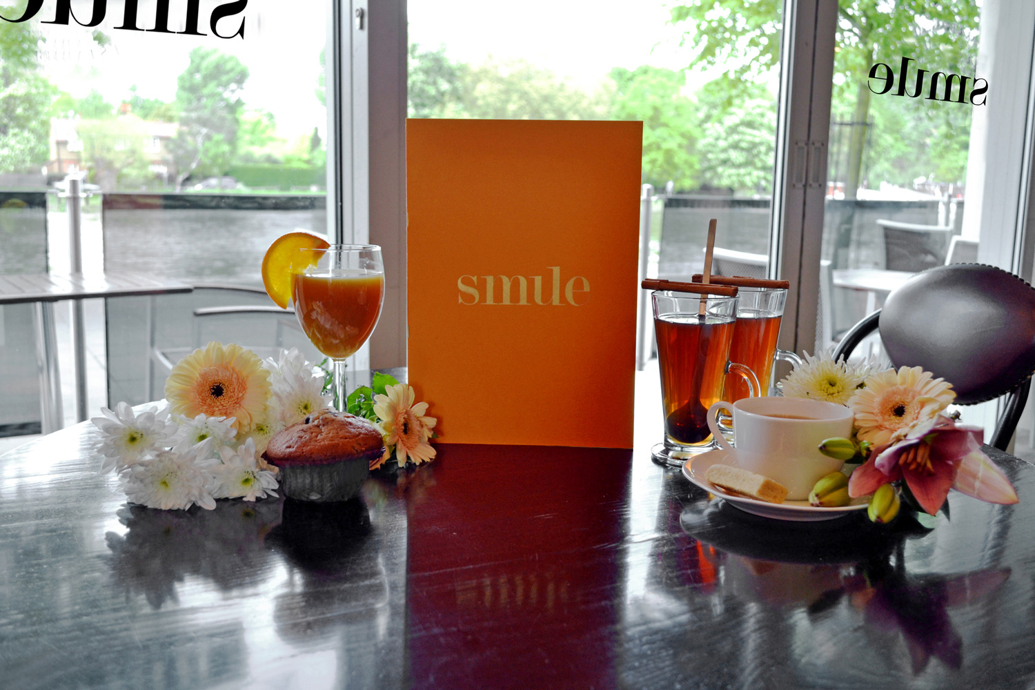
Smue is the concept of an alternative to traditionally conservative afternoon teas with a new drinking and socialising experience. Why not add a wee dram to your tea to liven things up a little? Combining Scotch whisky with drinks, food and music, Smue can be found at both permanent and pop-up bars that target events such as ladies day at the races and Wimbledon lawn tennis.
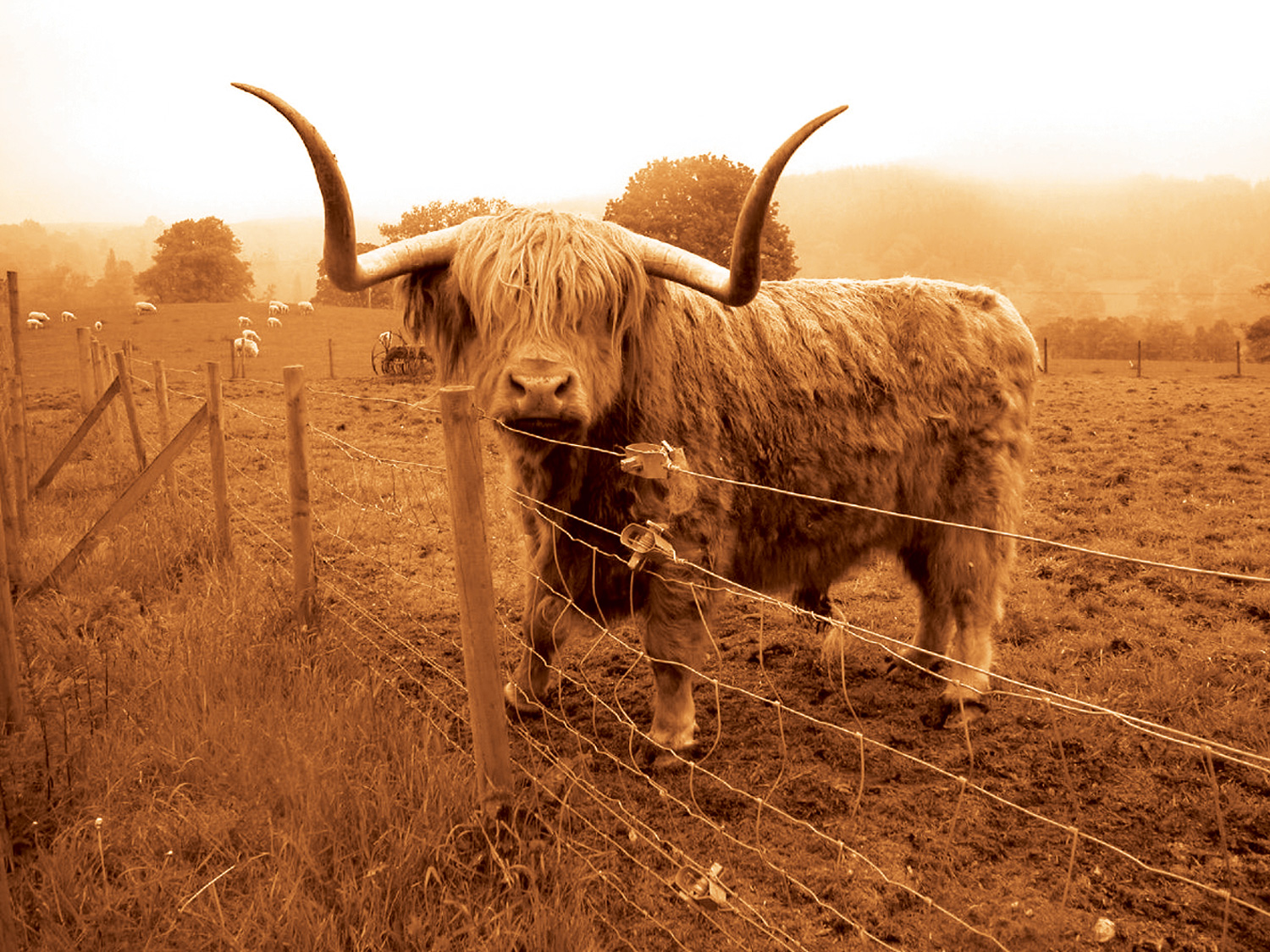
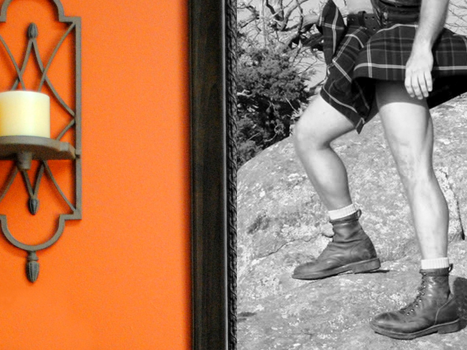
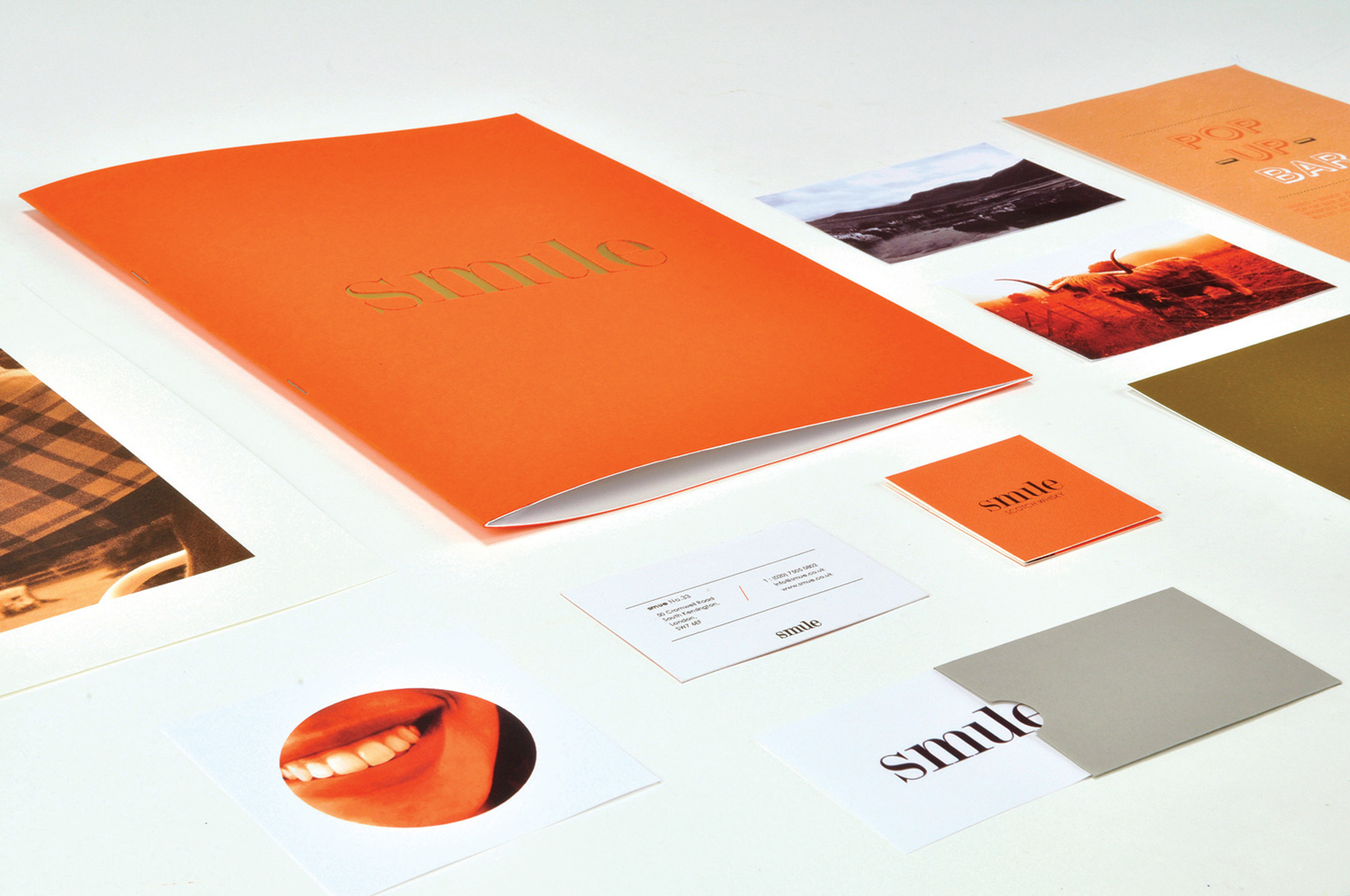
Scottish imagery and the orange palette reflect the origins of the drink, completing the story and feel of the brand in all online and printed elements.
© Jo Hawkes 2020


